NEWS + STORIES
DESIGNING THE “MOTHER” CAMPAIGN
A Powerful Call for Solidarity and Ethical Fan Engagement in Women's Sports
Los Angeles, 04.02.25
This past weekend, founder Kristen Branch submitted the MOTHER campaign for the Print Magazine Citizen Design Award—a social justice design category that highlights ethics, activism, and the power of design as a tool for change. Below are the full details of the entry.
Print Magazine Citizen Design Award Entry
Designing Solidarity through the MOTHER Campaign
Fans hold immense power to shape sports culture, and with that power comes responsibility. The MOTHER campaign for WNBA All-Star Dearica Hamby is more than a T-shirt—it’s a call to action, a symbol of solidarity, and a challenge to rethink fandom’s role in women’s sports. The MOTHER T-shirt serves as visual advocacy, promoting a more ethical, compassionate, and supportive relationship between athletes and their fans.
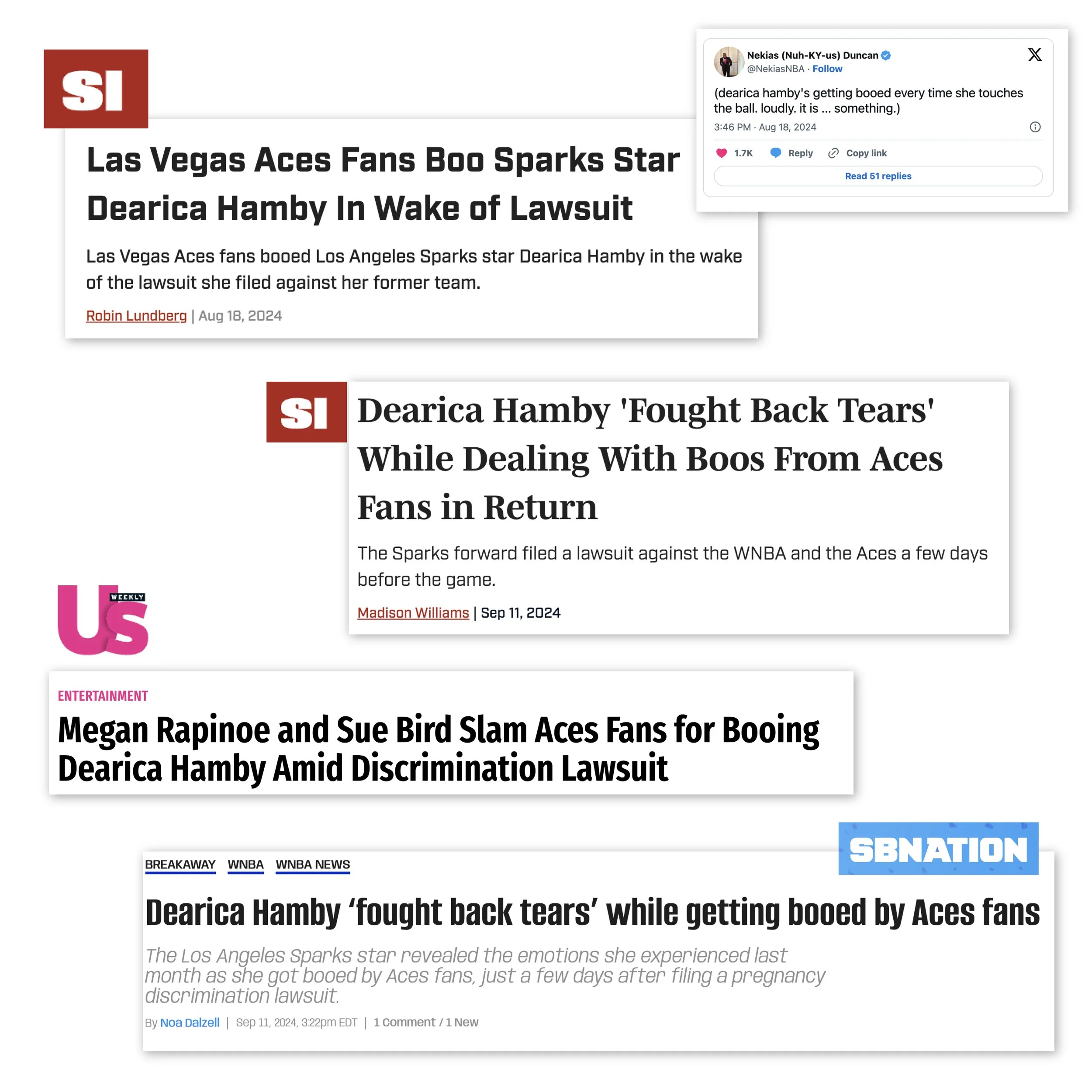
The campaign emerged after Los Angeles Sparks star Dearica Hamby—a mother and Olympic medalist—was loudly booed during her first game back in Las Vegas. This followed her filing a federal lawsuit against the WNBA and the Aces, alleging discrimination and retaliation after announcing her pregnancy, which led to her forced trade to the Sparks. The incident highlighted a larger issue: the lack of respect female athletes, especially mothers, often face.
The MOTHER campaign is a response not only to Hamby’s mistreatment but also to encourage a broader reflection on fan behavior. It’s a statement that athletes like Hamby—who stand for more than just the game—deserve respect. Women in sports face challenges beyond performance, and it’s time for fans to consider their role in supporting them.
The Design Strategy & Semiotics: A Visual Statement for Change
At the core of this campaign is the MOTHER T-shirt—a visually striking statement designed to challenge perceptions and spark change. The design is simple yet layered with meaning, using semiotic signs to communicate a powerful message about justice, identity, and respect for women in sports.
Each element functions as a sign, composed of a signifier (the tangible visual element) and a signified (the deeper meaning it conveys):
Primary Semiotic Elements (T-Shirt Front)
Sign: The word “MOTHER” in bold, uppercase Futura, framed within a box.
Signifier: A strong, boxed typeface in high-contrast, an assertive style.
Signified: Represents strength, resilience, and a reclamation of power. The choice of Futura pays tribute to Barbara Kruger’s iconic style, critiquing power structures and advocating feminist messages. The boxed framing emphasizes control, asserting the need for respect and visibility for women in sports.
Sign: The word “MOTHER” placed across the eyes, blindfolded.
Signifier: Bold text covering the subject’s eyes, creating a blindfold effect.
Signified: A direct reference to Lady Justice and the principle of “blind justice,” , symbolizing that justice should be administered without bias. The obscured eyes challenge the viewer to avoid preconceived judgment, especially in the context of the pregnancy lawsuit, demanding fairness and equal treatment for women in sports.
Sign: The posterized render of Dearica Hamby.
Signifier: A high-contrast, propaganda-style image.
Signified: A nod to political movement imagery, evoking activist posters and propaganda art used to drive social change. The visual treatment reinforces the urgency of the message, aligning the campaign with historical moments of resistance and the fight for gender equity in sports.
Sign: The Olympic medal worn by Hamby.
Signifier: A prominently displayed medal.
Signified: Represents validation of excellence and worthiness. The medal asserts that Hamby, and all women athletes, deserve recognition beyond their roles as players or mothers. It challenges the idea that accolades don’t guarantee respect or fair treatment for women in sports.
Sign: The color WNBA orange.
Signifier: The signature hue from the WNBA brand identity.
Signified: A direct connection to women’s basketball, symbolizing unity, empowerment, and the ongoing fight for visibility and equity in the sport. This color roots the campaign within the cultural and institutional framework of the WNBA, reinforcing its call for justice and representation.
Back Design
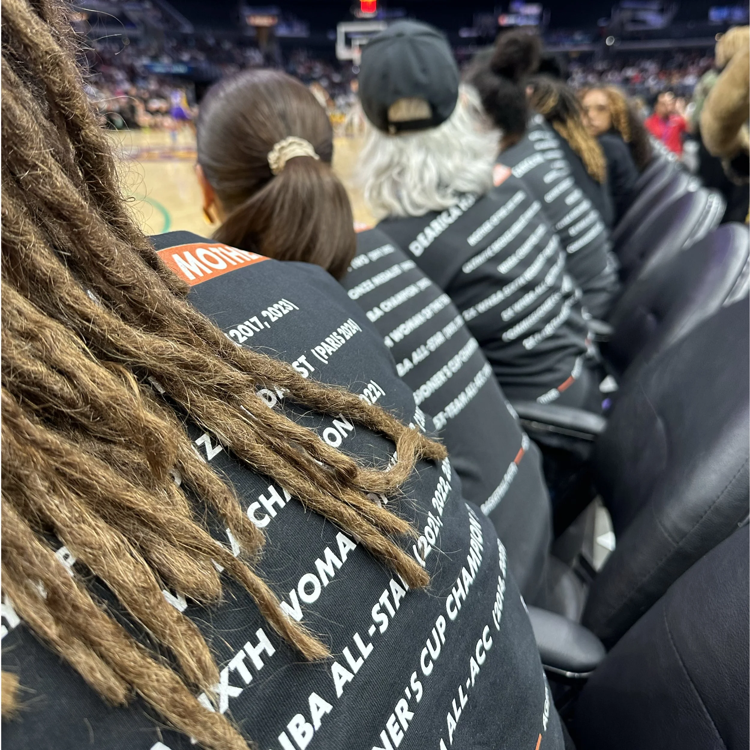
The back emphasizes the MOTHER concept, listing Hamby’s most personal achievement: Mother of Two (2017, 2013), followed by Olympic Bronze Medalist (Paris 2024). Below, a foundational line structured to communicate that Hamby is a multifaceted individual—mother, player, and agent of change—underscoring the complexity and multidimensionality of her identity.
Design Strategy Conclusion
By integrating these semiotic elements, the MOTHER T-shirt becomes more than just apparel—it transforms into a cultural artifact, a protest statement, and a symbol of advocacy. The design demands recognition of women as whole individuals whose identities, including motherhood, deserve full respect. This campaign challenges the status quo, confronts injustice, and redefines how women in sports should be seen.
The Impact: Amplifying Change Through Design
On August 28, 2024, fans wore the MOTHER T-shirt in solidarity with Hamby at the first LA Sparks’ home game following the incident with notable super fan and comedian Leslie Jones, supporting and partaking in the demonstration. The T-shirt showed the power of design to unite a community and mobilize support. Dearica’s smile upon seeing the crowd was a powerful testament to its personal impact. She later expressed her gratitude on social media, highlighting the design’s influence.
The MOTHER T-shirt was not just a reaction to an individual incident. Rather, it was a call to reshape fan engagement in women’s sports. The campaign sparked conversations on gender discrimination and fan responsibility in shaping the culture of women’s sports.
The Broader Movement: Fans Rise Up
The MOTHER campaign is part of the Fans Rise Up movement, urging fans to reflect on their role in shaping women’s sports culture. It calls for deeper discussions on fan ethics and boundaries, highlighting the impact of their actions on women’s sports.
Conclusion
The MOTHER campaign is a visual statement, an advocacy tool, and a call to reflect on the role of fandom in women’s sports. It challenges us to consider how we can create a culture where athletes are treated with respect and dignity, regardless of their gender or motherhood status. Through design, we have the power to shape that culture. The campaign inspires lasting change in how women in sports are perceived and supported. Fans are not just spectators—they are catalysts for change.


